Works from my 2nd Year at HLW
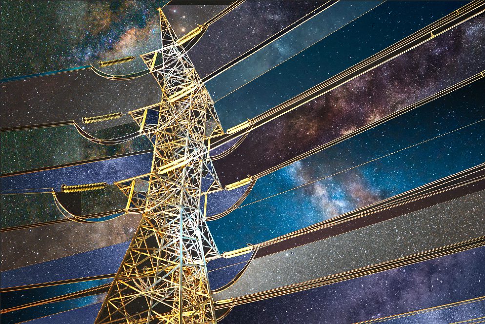
Power Pole beneath the Starry Sky
This was our first project in Photoshop, where we learned how to use layer masks to seamlessly combine different images. The task was to insert a unique image of the sky between each line of a power pole, creating a surreal and creative composition.
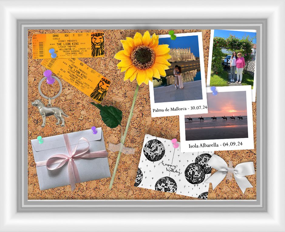
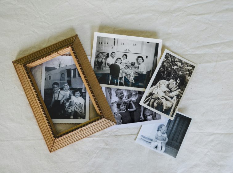
Personal pinboard
In this project, we used layer masks and shadow effects to create a personalized pinboard that reflects who we are. I included a keychain of a dog at the top, because I have a dog myself, postcards from The Lion King—my favorite musical—and photos capturing special moments and important people in my life.
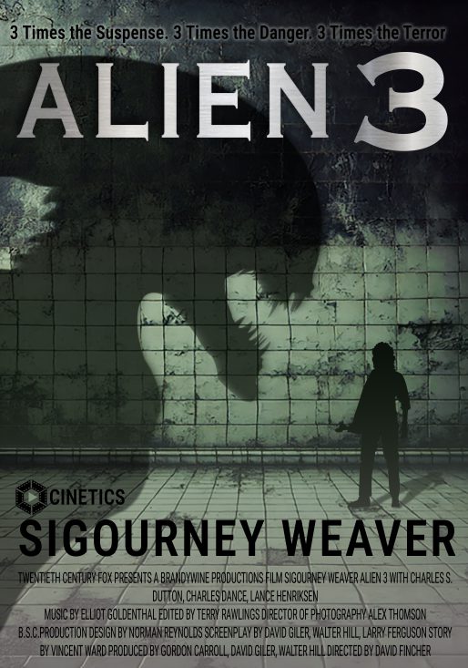
Alien 3 poster design
For this assignment, we were asked to design our own cover for the movie Alien 3. The cover had to include specific text elements, so we spent time exploring poster design in depth. I also created the logo for a fictional production company called Cinetics, which is featured on the cover.
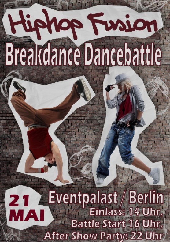
Breakdance battle flyer design
In this task, we designed a poster for a breakdance battle in an urban style. We worked with paths and vector masks, and once again had to incorporate various text elements. A key focus was also on the creative design of the typography to match the dynamic and edgy theme.
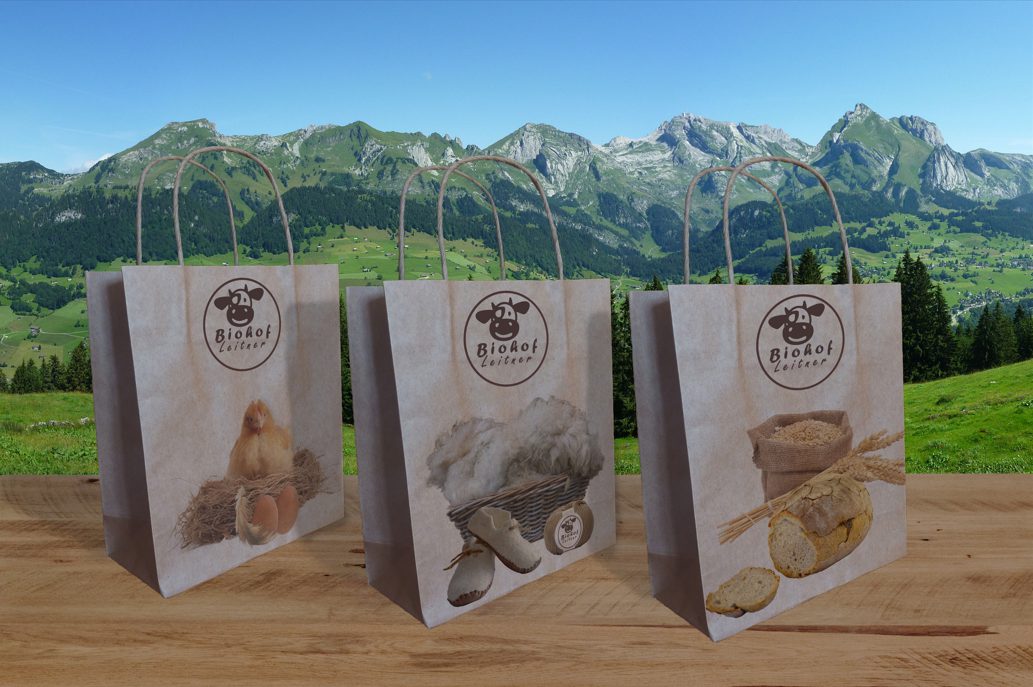
Design for organic farm bags
In this project, we were tasked with designing eco-friendly paper bags for an organic farm—including creating the farm’s logo ourselves. It was important to make the designs look realistic when applied to the bags and to ensure a cohesive, sustainable overall look.
Mockup exercise
In this assignment, we learned how to create mockups using smart objects. That meant turning an image into a smart object and embedding it into another image. The smart object allows the inserted image to be replaced with just a few clicks, saving a lot of time and effort. We also worked with filters to enhance the overall look of the mockups
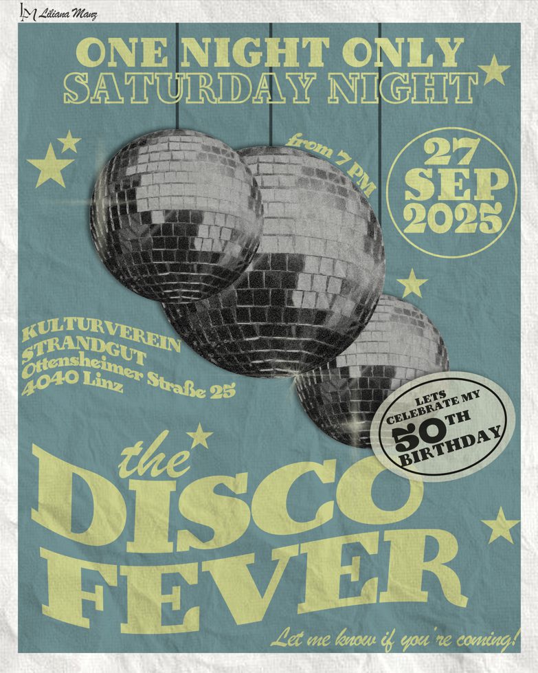
Birthday invitation
This was a birthday invitation for my mom. I wanted to capture the style of 1975, the year she was born, so the design had a slightly vintage look. The colors were chosen to suit her personality, and the overall layout was inspired by a classic disco party poster.